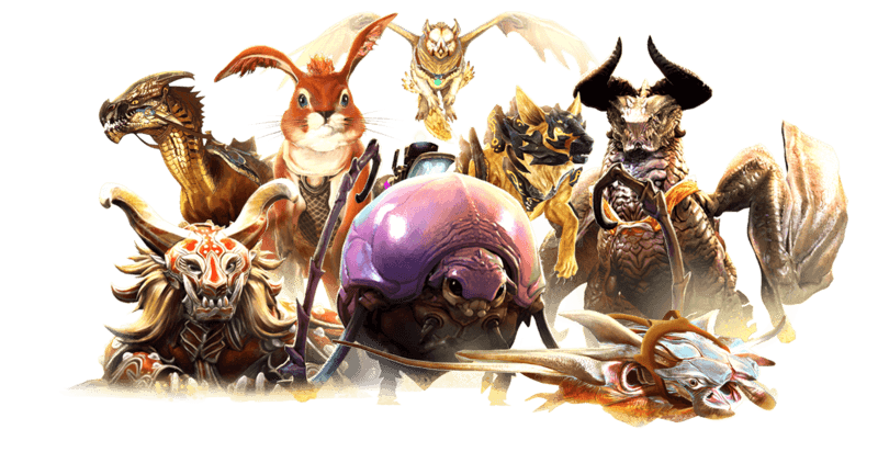
Guild Wars 2 UI Refresh
Enhancing player immersion by reimagining the character select screen as both a gateway and a visual showcase of player achievements
Role
UI Designer
UX Researcher
Industry
Gaming
Timeframe
Personal Project
2 Weeks
Tools
Adobe Photoshop
Figma
FigJam
Skills
Video Game Interface Design
User Research
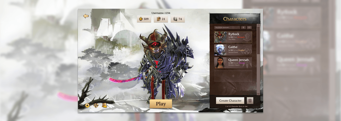
Overview
Guild Wars 2 is an open-world MMORPG (Massively Multiplayer Online Role-Playing Game) known for its expansive world-building and complex storytelling.
As a veteran player, I noticed that the character select screen had some glaring problems and questions that needed to be answered.
What is a "Character Select Screen"?
A character select screen is where players choose which character to play in a game before embarking on actual gameplay. Depending on the type of game, they might select from preset characters (like in fighting games or puzzle games) or from characters they've created and customized (common in role-playing games).
As a result, I spent two weeks recreating the character select screen, conducting extensive research on the game's artistic style and gathering insights from primary sources, including player feedback and observations, to address pain points and meet player needs.
Initial Evaluation
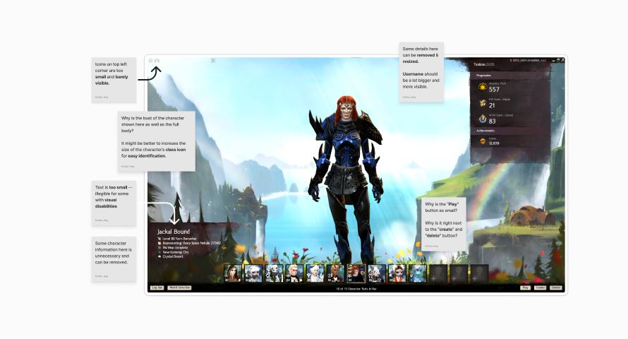
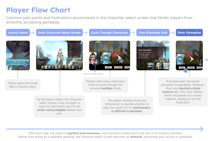
I initially thought to tackle consistent frustrations myself and other players had personally encountered in the character select screen of Guild Wars 2.
These frustrations included —
• Indistinguishable icons against the background
• Unnecessary character information
• No clear visual hierarchy
• Illegible text
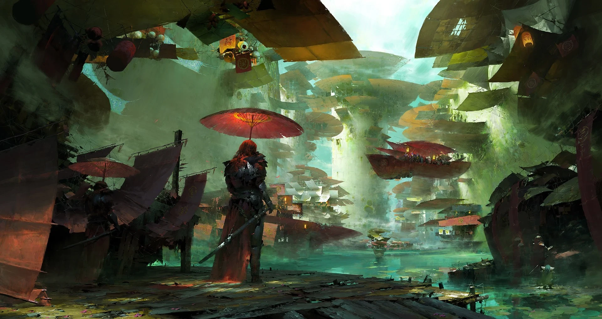
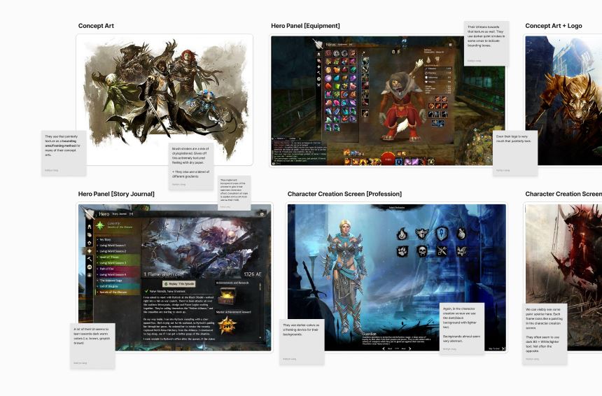
Guild Wars 2 features a distinct art style, achieved through digital painting.
After thorough research, I analyzed their design system and visual philosophy, keeping note on the developers' clear emphasis on immersion and gameplay.
This focus explains why their current UI remains minimal and largely non-customizable.

With these considerations in mind, I wanted to solve a problem:
How might we redesign the Character Select Screen of Guild Wars 2 in order to create a seamless and intuitive experience for players?
With my general understanding of the game as well as an initial evaluation of the character select screen, I created a prototype of what I thought to be a large improvement from the original.
A Closer Look
However, several rounds of testing revealed that there were many underlying problems and edge cases that were not addressed with the previous iteration.


After synthesizing information from player interviews and both primary & secondary research, I identified some key insights —
Although the refresh resolved existing issues with visual hierarchy, players reported increased frustration with a lack of perceived information.
I had not initially considered that players might benefit more from the introduction of new quality-of-life features rather than a simple refresh of the current design.
Players see the character select screen as both a gateway to gameplay and a showcase of information and their achievements, influencing their decision to play.
Competitive Analysis
The previous insights revealed inklings alluding to the multi-faceted nature of the character select screen.
Through competitive analysis, I wanted to understand whether this held true for other games, or if there was more to this idea that I previously did not perceive.
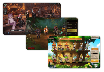
Some key takeaways from the competitive analysis include —
Player characters were prominently displayed against an immersive backdrop, serving as both a showcase of achievements and a gateway into the game.
Key information, such as level progression, gear, and accomplishments, should be displayed to help players differentiate between characters and deepen their connection to their in-game success.
With these newfound insights, the problem was refined to
address the previously overlooked factors
The current character selection screen lacks immersion and fails to effectively showcase player achievements, limiting players' ability to make informed decisions and ultimately discouraging them from engaging with gameplay
How might we transform the character selection screen into a more immersive and informative experience that not only showcases player achievements but also enhances decision-making through new quality-of-life features?
Refining Focus for Ideation
Before ideating, I prioritized identifying the essential features and outlining the key considerations that would help guide the process.
Key Considerations —
Balancing the developers' emphasis on immersion with the need to intuitively convey important information.
Recognizing that a significant portion of the player base is older (80% are 30+, with about 20% aged 50+), making accessibility for visual impairments and disabilities a crucial concern.
Ensuring that every element leading up to the gameplay experience is seamless and obstacle-free, allowing players to focus on what matters most—having fun (after all, this is a video game!)
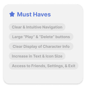
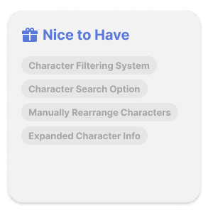
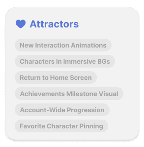
Feature Prioritization —
Using the KANO model, I had interviewees rate the desirability of each feature, which resulted in a clear understanding of what players considered essential, desirable, and delightful.
Revisiting our Design Challenge —
Lastly, I reviewed our HMW statement and extracted key terms to guide and sharpen the ideation process.
How might we transform the character selection screen into a more immersive and informative experience that not only showcases player achievements but also enhances decision-making through new quality-of-life features?
Immersive
Informative
Showcase
Achievements
Decision-Making
Quality-of-Life
Crafting a Solution
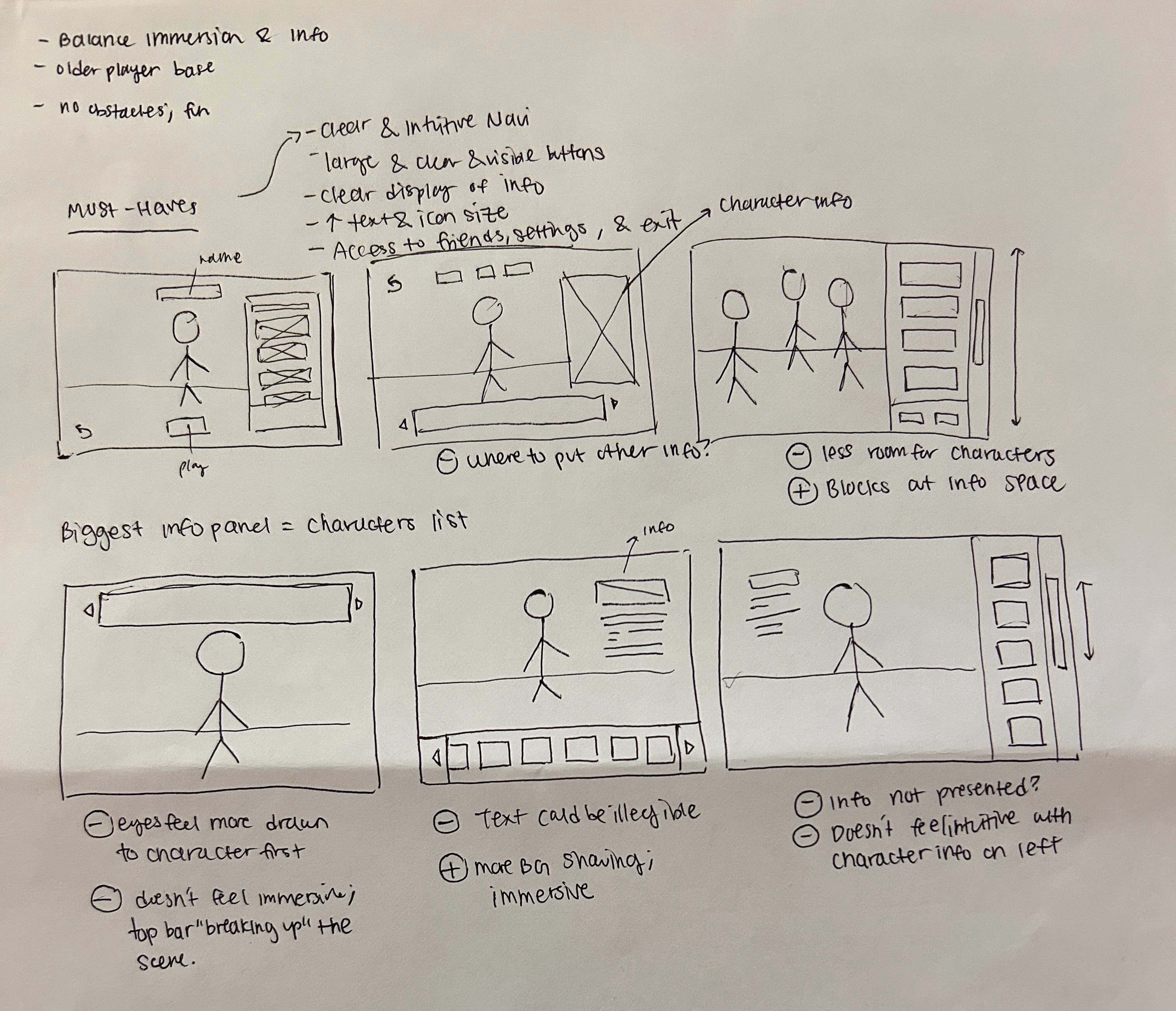
Building on the previously identified insights, I moved into rapid prototyping. The main challenge was determining the optimal placement for the character select list, as it not only needed to present a large amount of information but also provide crucial details for players to make informed decisions before starting gameplay.
I created three lo-fi prototypes and presented them to five players with varying levels of experience. Each player rated the layouts on a scale of 1 to 3, with 1 being their preferred option and 3 being the least in various categories.
Quickly exploring a large breadth of ideas on paper before moving into higher-fidelity mockups.
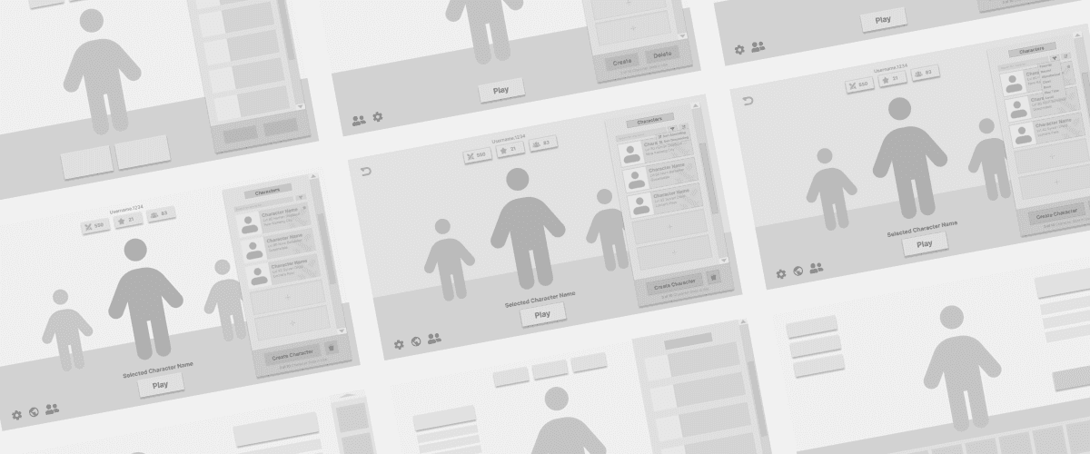
Based on earlier insights, I refined the sketches into three layouts and further developed them in Figma. I gathered qualitative and quantitative data from interviews to compare the prototypes. Key insights are below.
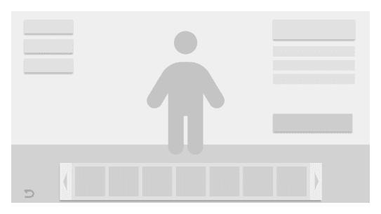

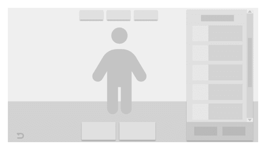
Floating panels feel immersive
Info displayed neatly
Overwhelmed by panels
Feels congested
Possibly click multiple times
Enlarged character
Too many panels on the right
Feels unfamiliar to use
Need more info for characters
Floating panels feel immersive
Clear areas for information
Balance of info & immersion
Final Solution
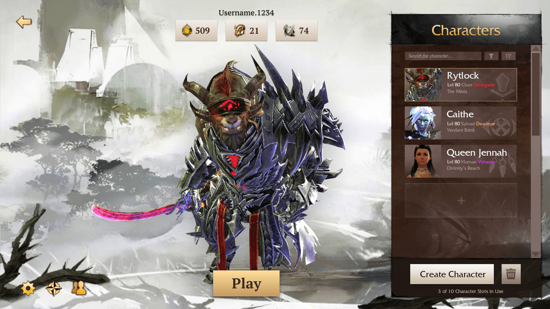
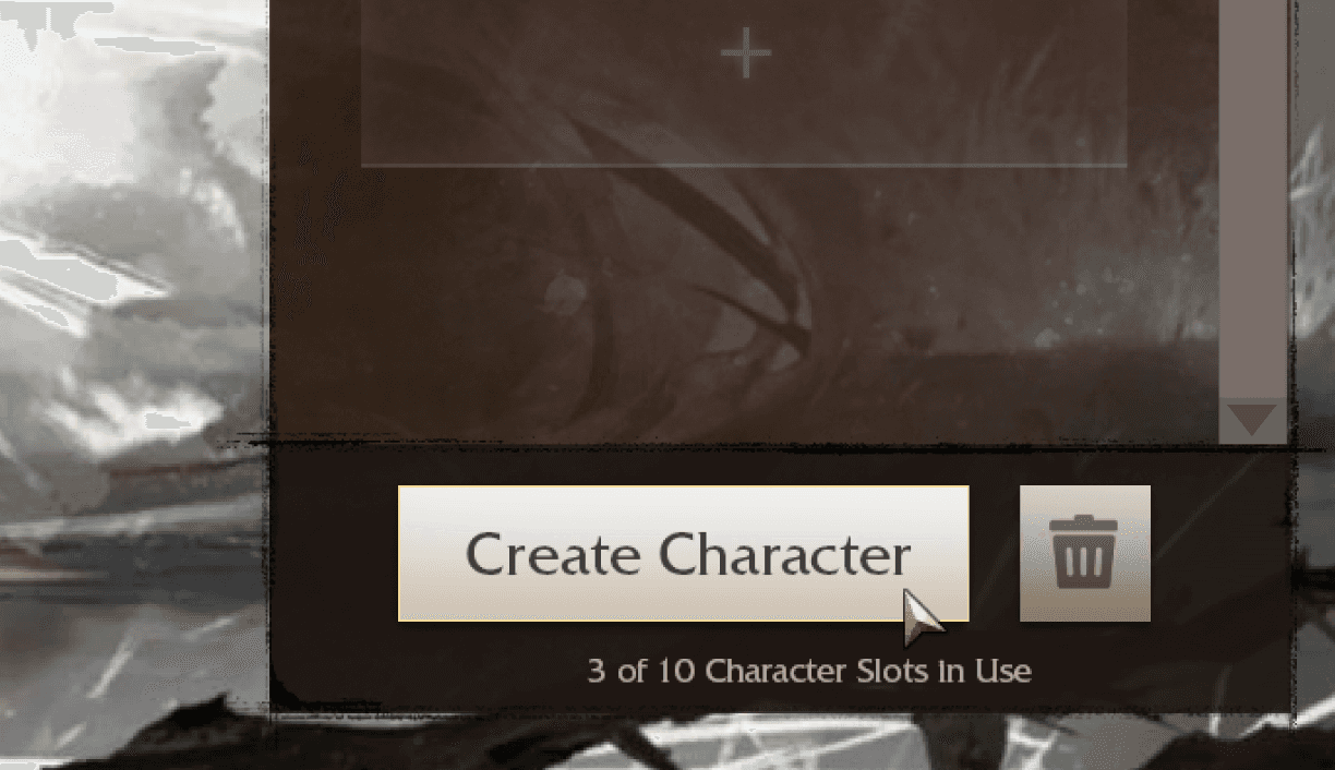
Large and clearly defined buttons, sized according to their importance, to enhance accessibility for players with visual disabilities or impairments.
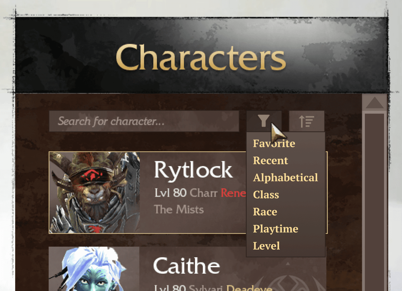
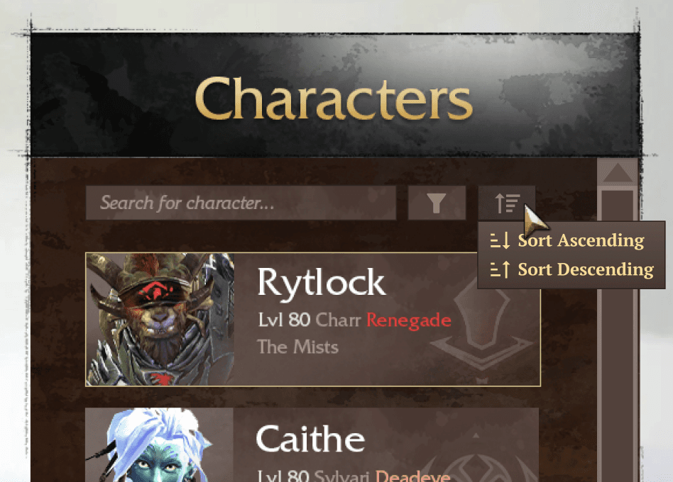
An intuitive filtering and sorting system for easy access to specific characters, benefiting both new and veteran players.
Streamlines selection and offers a sense of accomplishment by showcasing players' character collections.
Easy access to key features with large, easily visible icons for improved navigation

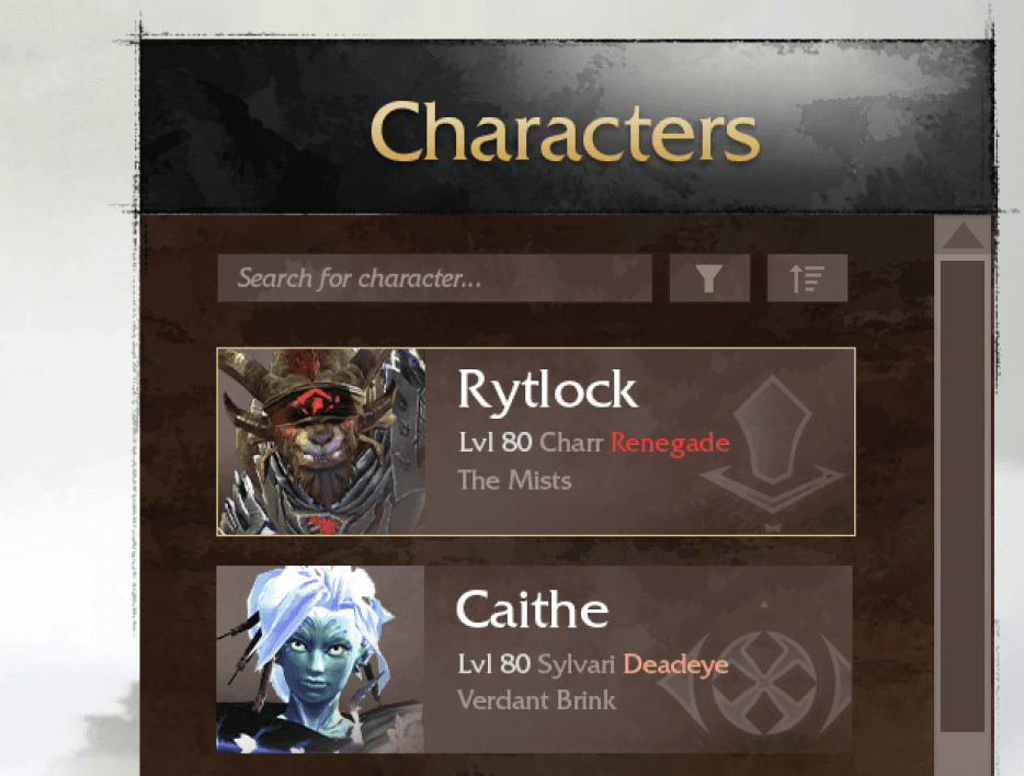
Clear display of character info with visual hierarchy and contrast, enabling players to quickly see, digest key information, and efficiently select their characters without obstacles
Key Takeaways
A reflection of the overall journey and the many challenges tackled along the way
Being okay with straying from rigid design processes
Flexibility was key throughout this project. While following design frameworks is valuable, I learned that adapting to unexpected challenges often requires breaking away from a linear approach.
Clearly defining what goal I wanted to achieve
I had a difficult start due to my inability to properly understand the problem space. This was something I could've easily avoided with ample planning and research.
Thinking cross-functionally
Balancing player needs and developer values was critical throughout the process — It was tricky to strike a balance, especially when opinions were directly clashing.
Constantly asking questions throughout the project
I discovered the importance of seeking input from stakeholders at every stage of the process, as their insights were invaluable for shaping the design.
Thanks For Reading!
